


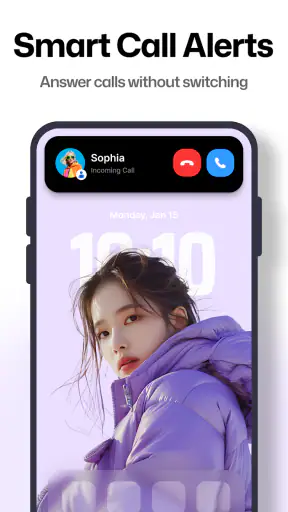
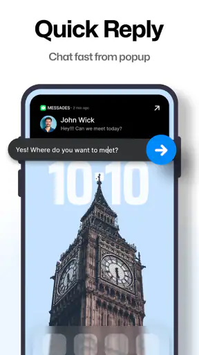
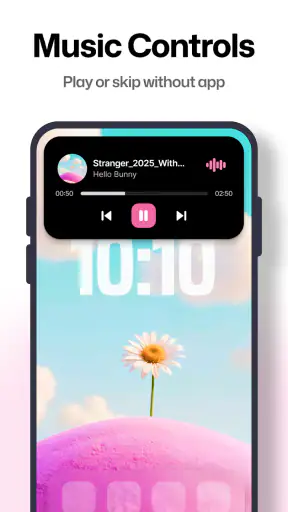
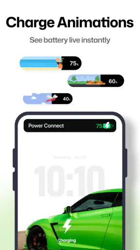
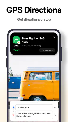
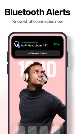
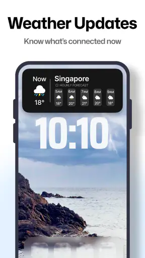
I tried Dynamic Notch Notification Bar as a small productivity tool rather than as a full notification replacement, and that distinction matters. Its purpose is simple: it adds a dynamic notch-style bar to the phone interface, giving notifications a more visible place to appear. The idea is less about creating new information and more about changing how incoming alerts are presented.
That sounds like a cosmetic adjustment, but it can affect how quickly I notice messages, reminders, and other prompts during the day. Instead of relying only on the traditional notification shade, I get a more prominent visual cue near the top of the screen. Whether that feels useful or distracting depends heavily on how often I want alerts to compete for my attention.
How the dynamic bar changes everyday notification checking
The central capability is the dynamic notification bar. It imitates the visual behavior many people associate with a modern phone notch, turning the upper part of the display into a more noticeable notification area. I found the appeal easiest to understand when using the phone while moving between apps: the alert presentation feels more immediate than a tiny status icon that I might overlook.
This is not a productivity suite with notes, calendars, task lists, or document editing. It belongs to the productivity category because it changes the way I interact with information already arriving on the phone. The practical benefit is therefore narrow but clear: I can make notifications easier to notice without repeatedly pulling down the notification panel.
The developer is Mahashivratri App, and the application is free to install. It is suitable for Everyone, which makes the concept approachable for people who simply want a more visible notification treatment without learning a complicated workflow. The current version is 6.3, and it runs on Android 8.0 or later, so compatibility covers a broad range of devices.
One useful way to think about it is as an attention filter. A conventional status bar asks me to remember to look upward and interpret small symbols. A dynamic bar tries to make the arrival of an alert visually obvious. That can be helpful for short, frequent checks, especially when I am waiting for a message and do not want to open the notification shade every few minutes.
What I noticed during normal phone use
In everyday use, the feature makes the most sense when I keep the phone active for other tasks. If I am reading, browsing, or switching between apps, a notification that appears in a more prominent position is harder to miss. I do not have to abandon the current screen simply to find out whether something new arrived.
There is also a psychological difference. A tiny icon tends to become background noise, while a changing bar attracts a deliberate glance. That is useful when I need timely awareness, but it also means the feature can increase interruptions. I would not enable a highly visible notification style for every application on a phone that already receives a large number of alerts.
My practical recommendation is to treat it as a selective layer rather than a universal broadcast channel. Keep the phone’s important alerts visible, but be cautious with shopping, social, promotional, and game notifications. The more sources appear through the bar, the less special each alert becomes. The feature works best when the signal remains more noticeable than the noise.
A second point is visual consistency. The dynamic bar is designed to create a notch-like presentation, so its value depends on whether that style fits the phone. On a device where the design feels natural, it can look like a built-in interface element. On another device, it may feel like an overlay added on top of the existing system design. I would spend a little time deciding whether the visual effect feels integrated before making it part of my daily setup.
A realistic workday example
Imagine I am working from a café and waiting for a time-sensitive message while editing a document. With the usual notification system, I may hear a sound, feel a vibration, or notice a small icon, but I still need to interrupt the document to inspect the alert. The dynamic bar gives me a more obvious visual prompt near the top of the screen, letting me decide whether the message deserves immediate attention.
That does not eliminate the need to open the notification when I want the full content. Its advantage is the first decision: ignore it for now, or switch tasks. In this scenario, the bar is valuable because it reduces uncertainty without pretending to replace the notification panel.
The same workflow can help when following delivery updates, waiting for a colleague, or monitoring a reminder while using another app. I particularly like the idea for people who often miss notifications because they are focused on a different screen. It is less compelling for someone who checks the notification shade habitually and already catches everything through sound or vibration.
Small habits that make the feature more useful
My first tip is to test it during a normal day instead of judging it from a quick setup glance. The real question is not whether the bar looks attractive for a minute; it is whether it helps me recognize important alerts without creating unnecessary visual pressure.
My second tip is to use it around a specific problem. If I frequently miss messages while reading or working, I can evaluate whether the bar solves that issue. If my problem is too many notifications, making every alert more prominent may move me in the wrong direction. In that case, reducing noisy alerts in the phone’s existing notification controls is the better first step.
A third useful approach is to compare glance value with interruption cost. I would ask myself whether the bar lets me make faster decisions or simply encourages more checking. For people trying to reduce screen time, a prominent alert can be counterproductive. For people who need quick awareness, the same visual treatment may be exactly what they want.
Where it fits, and where it does not
The usual alternatives are the standard notification shade, status icons, lock-screen alerts, sounds, and vibration. Those options are more deeply integrated into Android and generally require less adaptation. Dynamic Notch Notification Bar is different because it focuses on presentation. It gives notifications a distinctive visual stage instead of adding another task-management system.
That makes the comparison fairly straightforward. If I want reliability, system notifications remain the foundation. If I want a more noticeable glance experience, this app adds something the default interface may not emphasize in the same way. I would not install it expecting it to organize alerts, prioritize tasks, or replace a calendar. Its strength is visibility, not information management.
The app has attracted a 4.7 average from around 221 thousand ratings, with more than 5 million installs. Those figures suggest that the concept has found a substantial audience, but they do not remove the need to judge the visual style on my own phone. A feature based on appearance and attention will always feel more personal than a background utility.
The tradeoff between visibility and calm
The biggest limitation is also the main design choice: a more visible notification can become a more demanding notification. If I receive alerts constantly, a dynamic bar may make the phone feel busier rather than more organized. I need to be intentional about which notifications deserve this level of prominence.
There is another tradeoff for people who prefer a clean, minimal interface. The notch effect may add personality, but it also changes the visual balance of the screen. Someone who chose a phone for its uncluttered design may prefer the ordinary status bar. Someone who enjoys interface customization may see the same change as a welcome improvement.
I would also avoid treating the app as a solution for missed notifications caused by poor notification habits. If alerts are disabled, muted, or buried by an overloaded setup, a new presentation layer cannot fix every underlying issue. The best results come when the phone’s existing alert choices are already reasonably organized.
Because the application is free, it is easy to try without an upfront purchase. However, in-app purchases range from $2.99 to $104.99 per item, so I would review any purchase screen carefully before confirming anything. The free starting point is convenient, but the presence of optional purchases means I would not assume every customization or extended option is included at no cost.
The age rating of Everyone makes it broadly accessible, and the Android requirement of 8.0 or later keeps it available to many older devices. Still, compatibility is not the same as identical experience. Screen shape, system interface, and personal notification habits can change how convincing or useful the notch-style presentation feels. I would test it on the actual phone I plan to use rather than relying only on the general platform requirement.
Who benefits most from this focused idea?
I think the strongest audience is people who regularly miss alerts while using other apps. This includes busy users who do not want to open the notification shade after every sound, as well as anyone who responds better to visual cues than to small icons. It may also appeal to phone owners who like the appearance of a dynamic notch but do not have that style built into their device.
It can be especially helpful for a person who wants a quick glance before deciding whether to stop what they are doing. That is a modest benefit, but it is concrete. The app does not need to manage my entire day to be useful; it only needs to make the first notification check clearer.
I would skip it if I dislike overlays, prefer the standard Android interface, or am actively trying to make notifications less noticeable. I would also choose a dedicated task or calendar app instead if my main goal is planning work, tracking deadlines, or organizing responsibilities. This tool can draw attention to an alert, but it cannot turn that alert into a structured productivity system.
For users who are unsure, the best test is simple: install it, observe whether important notifications become easier to catch, and then consider whether the extra movement at the top of the screen feels helpful or intrusive. I would keep it only if it improves a real habit rather than merely adding novelty.
My closing assessment
Dynamic Notch Notification Bar is a focused Android app built around one verified capability: making notifications more visually prominent through a notch-style bar. I appreciate that clarity. It does not try to be a notes app, a launcher, or a task manager. Its value comes from changing the moment when I first notice an alert.
In my experience, that makes it worthwhile for users who miss notifications during active phone use and enjoy a more expressive interface. The strongest results come from selective notification habits, not from displaying everything. If I keep the bar reserved for alerts that genuinely matter, it can make quick checking more convenient.
My recommendation is to try it as a visibility experiment, not as a complete productivity solution. People wanting a cleaner, quieter phone should stay with the standard notification system, while people wanting a more noticeable and distinctive glance experience may find this free app a useful addition. Its success depends less on how dramatic the effect looks and more on whether it helps me make faster, calmer decisions about what deserves my attention.
With its 4.7 average and more than a million users represented by its install count, it is clearly not an obscure experiment. Even so, its appeal remains personal: the same dynamic presentation that helps one user catch an important message may distract another. That is why I would judge it by one practical question—does the bar improve the way I notice notifications on my phone? If the answer is yes, this narrowly focused utility earns its place.


